Case Study
Feb 16, 2024

Summary
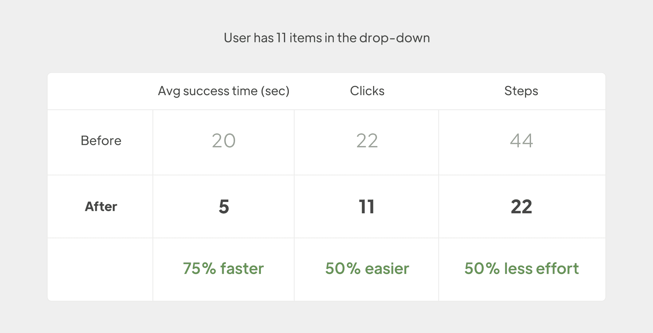
Switching between watchlists process was simplified, reducing task completion time by 75% and clicks by 50%. The enhancement was done without disrupting the dropdown's functionality, ensuring a smooth user experience.
My Role
Product Designer
Company
Farabi Brokerage Co
Product Manager
Zahra Mousavipour
Spent Time
3 Sprints
In the world of finance, we're all about making things faster for traders. Quick access to important information is key in fast-changing markets. Our team worked hard to create a dashboard where users can easily find what they need. By speeding up how quickly they get data, we help traders make smart decisions and stay on top of market changes. Our goal is to make the whole experience smooth and successful in the fast-paced financial world.
Problem
On our dashboard, there's a dropdown that's super important for users. It's where they check out their "Watchlists." But here's the thing: after looking at how people use it, I noticed they have to click a bunch of times just to switch between their different watchlists. So, I set out to find a way to make this process way easier and less clicky for everyone.
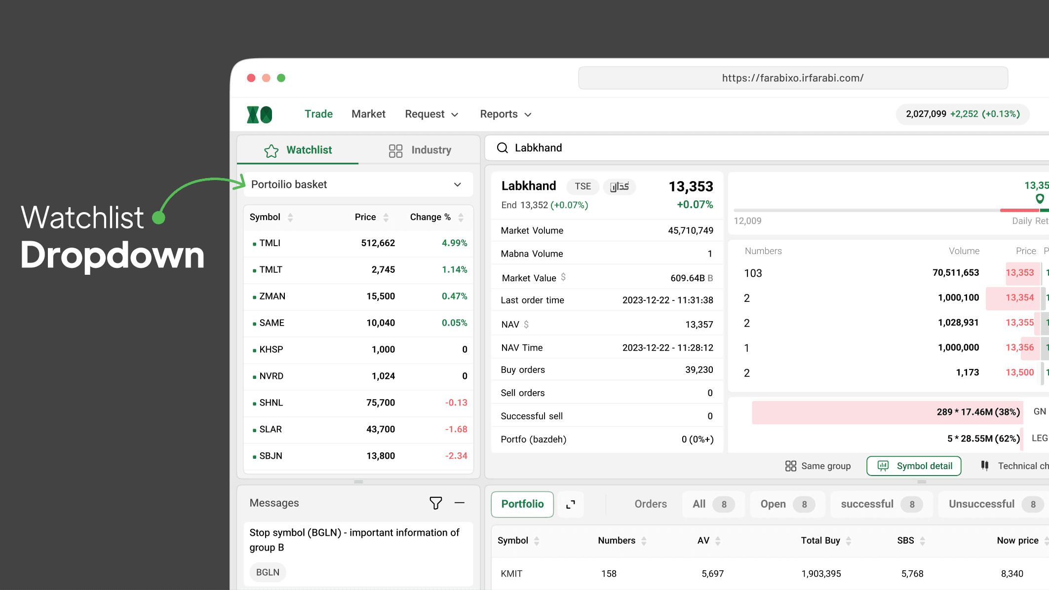
SolutionI
came up with a solution to help users switch between their watchlists respectively in an effortless way. We should also keep in mind that we don’t want to alter the main functionality of a drop-down, just make it smoother to switch between items in order.
Stories of Progress
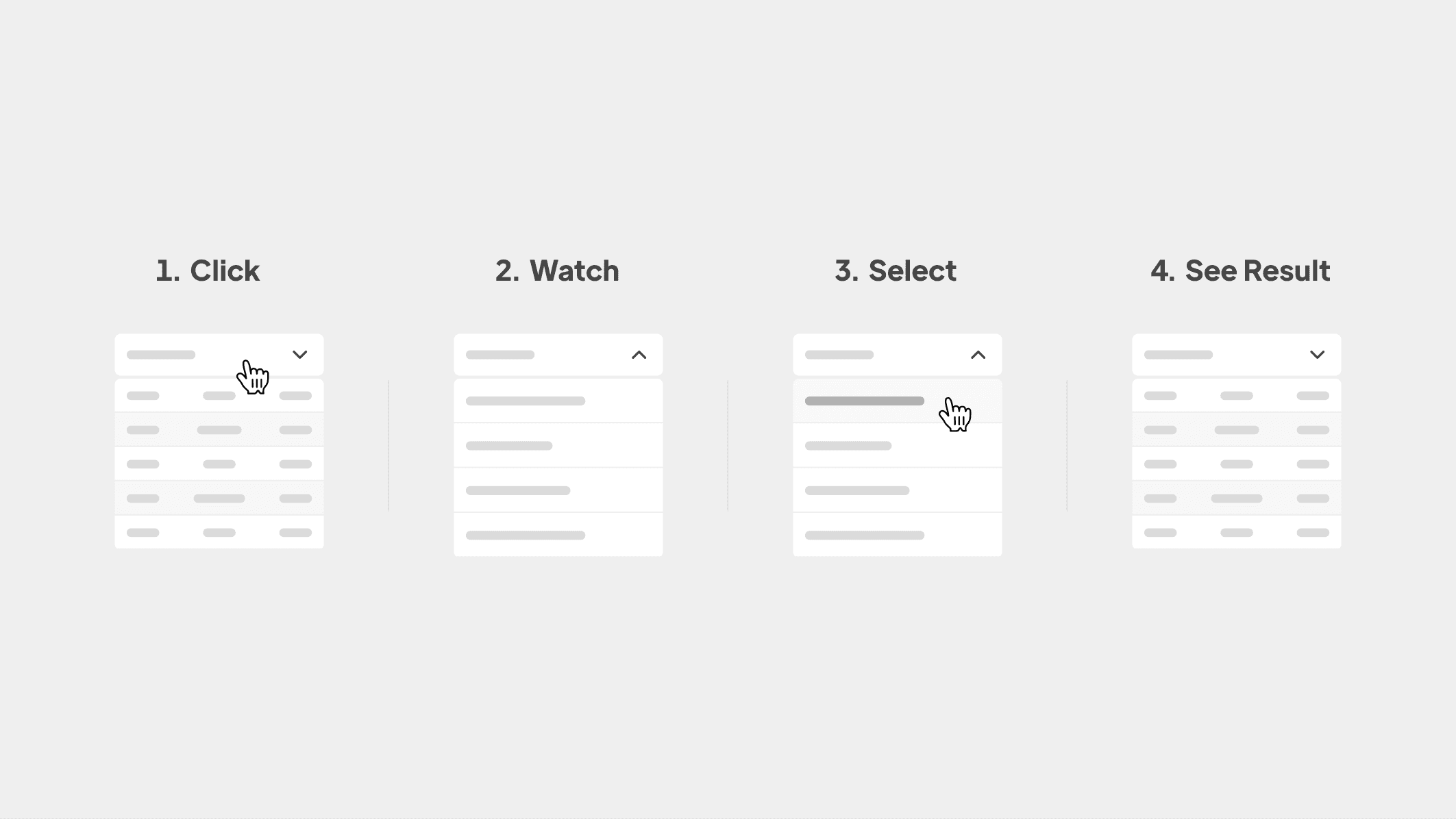
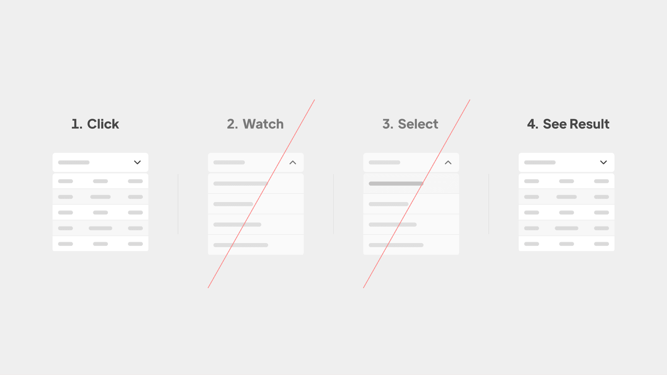
Users go to another item in a traditional drop-down with 4 steps, as shown in the below figure:
Usability Testing
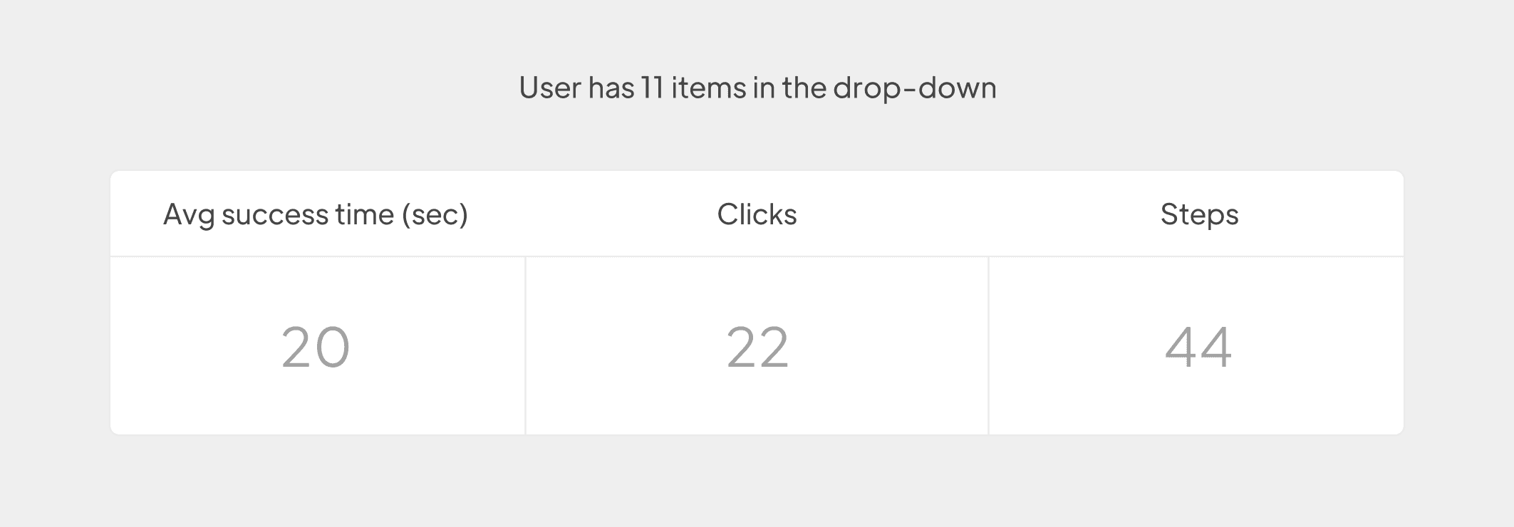
I ran an “Usability test” for 5 people, and I figured out that this flow takes about 2 seconds on average to complete. In one of the tests, a user with 11 items in the drop-down must click 22 times and 44 steps to switch between all the items and it took 20 seconds.
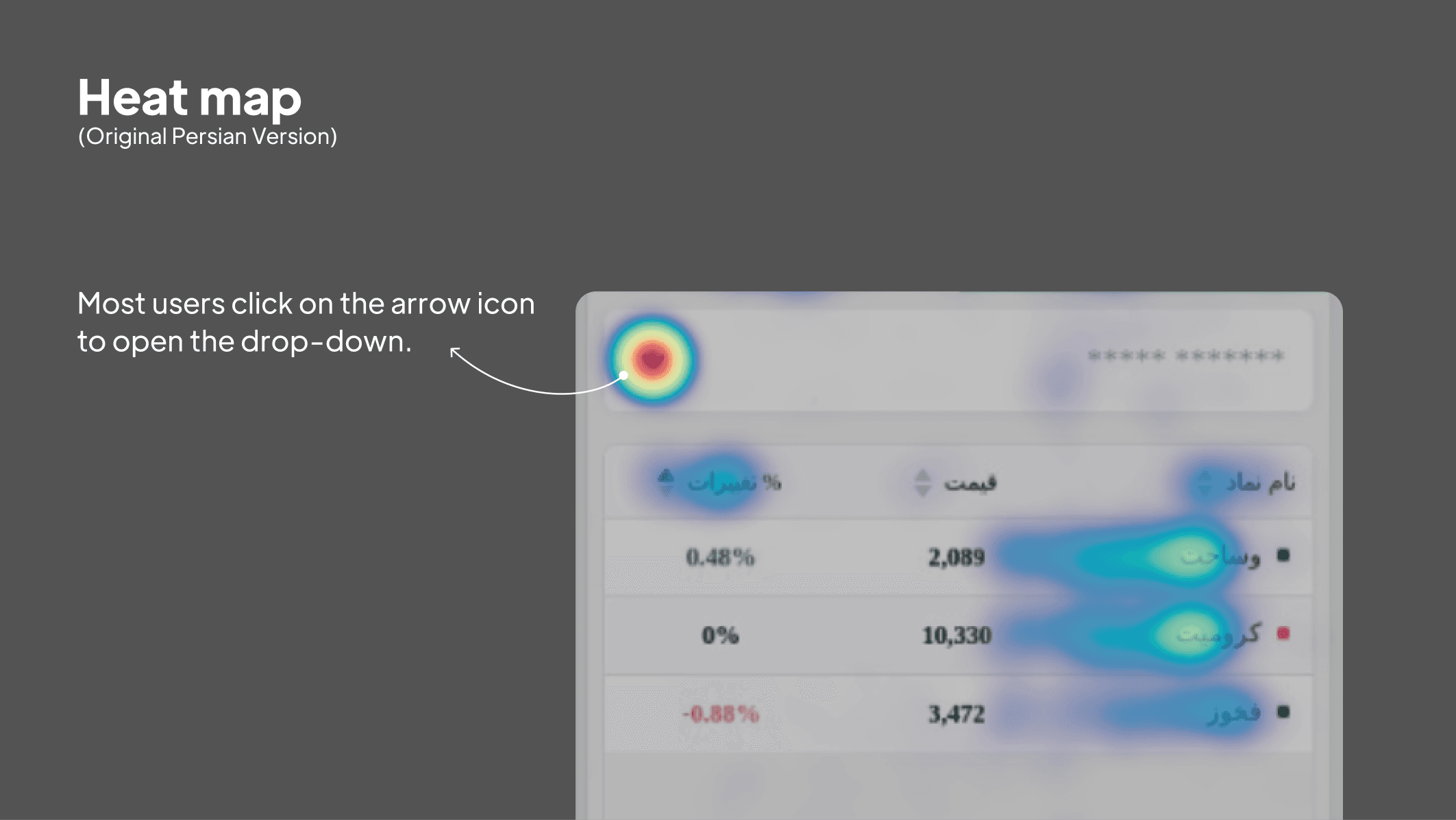
An interesting observation in the heatmap is that most users click on the arrow icon to open the drop-down. Knowing that, it's for the best if my solution reflects on this behavior.
Attention: This solution is only usable for users who need to go to the next/previous item in a drop-down.
Play with pen and paper
I start my ideation process with pen and paper, meticulously considering both data and users' needs. This step is crucial to me. After sketching, I generate three designs, carefully assessing their pros and cons.
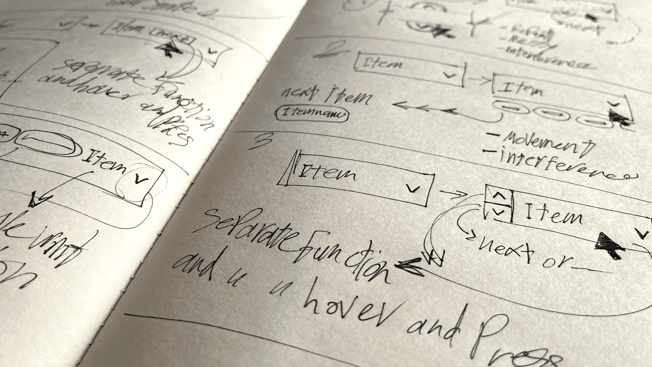
I did the sketches paying attention to the fact that most users would rather to go an item before or after the current item, so I could eliminate the second and third steps.
The first idea
In this design, the user can hover over the drop-down, and will open with no need for clicking:
Pros
It’s simple in the default mode (not hovered).
The user can see the next/previous items instantly and scroll to see the rest.
Cons
This design is not practical for touch screens.
The user might hover over this drop-down accidentally.
The second idea
In this design, users can only move to the next item easily. When the user hovers over the drop-down, they can see a chip with the next item name.
Pros
It’s simple in the default mode (not hovered).
Chip and the arrow don’t have any interference.
The user can see the next item effortlessly.
Cons
The user can only select the next item quickly and not the previous item.
This design is not practical for touch screens.
The third idea (Final choose)
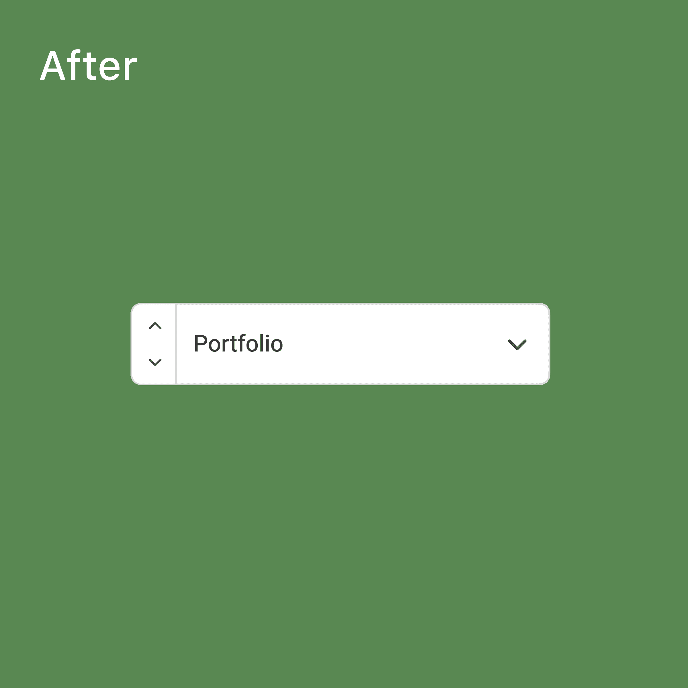
In this design, I used 2 arrows (up and down). When the user hovers over the drop-down, can see these arrows before the item name.
Pros
It’s simple in the default mode (not hovered).
Arrows are on the right and left sides and have no interference.
With a tooltip, the user can see the next/previous items’ names.
Cons
This design is not practical for touch screens.
Which one?
After careful consideration of the advantages and drawbacks, I've opted for the third solution as it aligns best with our dashboard and user requirements. I conducted an additional Expert Usability test involving 5 participants, revealing that this flow takes approximately 1 second. For users with 11 items in the dropdown, navigating through all items requires 11 clicks and entails 22 steps.
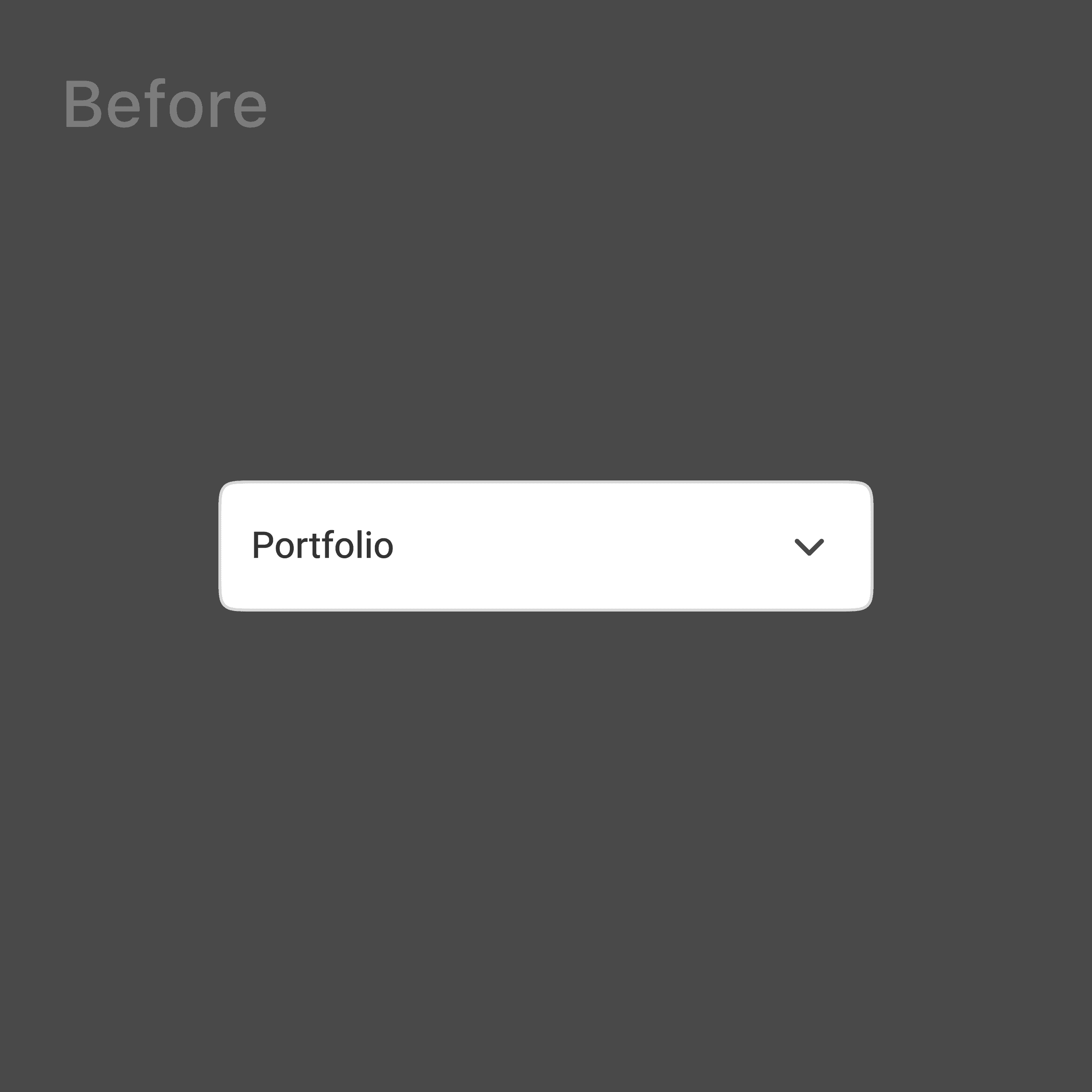
Before
After
Conclusion
With this design, I've successfully managed to reduce the time required for task completion by an impressive 75%, significantly improving the speed at which users can navigate through the watchlist flow. What's more, these enhancements have been seamlessly integrated without disrupting the traditional functionality, ensuring a smooth and uninterrupted user experience.
